Work / A rebrand and website for a tennis news and media site
Branding + EngineeringA rebrand and website for a tennis news and media site
Rebrand · Brand Style Guide · Website
Tennis Connected is a tennis news and media site covering the ATP and WTA tours with news, live scores, rankings, podcasts and gear reviews.
Rope Digital rebranded Tennis Connected, a tennis news, live scores and podcast site, with a new logomark, logotypes, colour palette, typeface and brand style guide, and built its website.
Client
Tennis Connected
Category
Brand Identity & Website
Result
New brand + website

The client
About Tennis Connected
Tennis Connected covers the professional game for fans around the world: tournament news and previews, live scores, rankings, a long-running podcast, gear reviews, a newsletter and tennis tickets through its partners. It has been covering Grand Slam tennis since 2008.
Its brand had not kept up with the content. The old logo looked dated, and the site needed to handle a lot of fast-moving content (scores, news, podcasts, reviews and partner placements) while still feeling like one modern brand.
Industry
Sports media
Region
Canada / global
Tennis Connected
Branding + Engineering · New brand + website
Tennis Connected is a tennis news and media site covering the ATP and WTA tours with news, live scores, rankings, podcasts and gear reviews.
The problem
What they came to us with.
01
A dated logo and inconsistent visual identity.
02
A content-heavy site (news, live scores, rankings, podcasts, gear reviews) that needed one clear structure.
03
No brand guidelines to keep the look consistent across the site, newsletter and social.
04
Advertising and partner placements that had to sit within the site without breaking it.
Our approach
How we thought about it.
We refreshed the brand while keeping what fans already recognised, then built the website around the content readers come for every day.
01 / Rebrand
Modernise, don’t erase
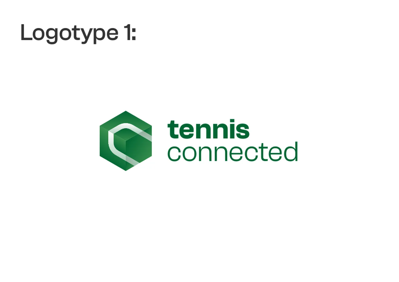
We kept the spirit of the original hexagon mark and reworked it into a cleaner logomark, with two logotypes and clear scaling rules.
02 / Colour and type
A confident tennis green
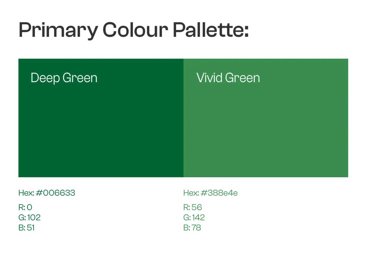
A primary palette of Deep Green (#006633) and Vivid Green (#388E4E) with neutral greys, and Clash Grotesk as the brand typeface.
03 / Guidelines
A style guide the team can use
A brand style guide covering logo usage, do’s and don’ts, colours and typography, so the site, newsletter and social stay consistent.
04 / Website
Built for daily readers
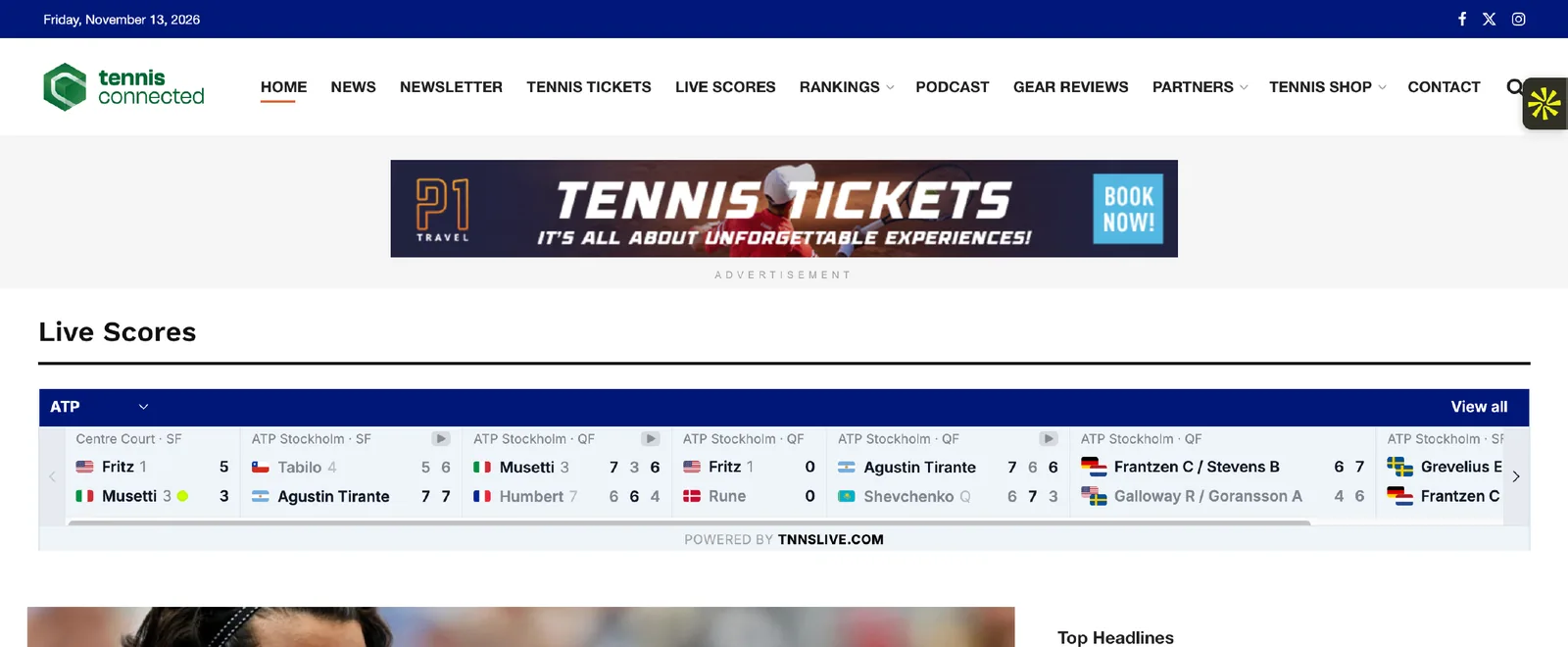
A website organised around news, live scores, rankings, podcasts, gear reviews, the newsletter and the tennis shop, with space for partner and ad placements.
The deliverables
What was built.
01 / New logo
A modernised hexagon logomark and two logotypes, with scaling and usage rules.
02 / Brand style guide
Overview, colours, logo system, do’s and don’ts and typography in one guide.
03 / Colour and typography
Deep and vivid greens with neutral greys, set in Clash Grotesk.
04 / Website
Homepage with live scores and top headlines, latest news, podcasts and gear reviews.
05 / Content sections
News, newsletter, tennis tickets, live scores, rankings, podcast, gear reviews, partners and shop.
06 / Newsletter and partners
Newsletter sign-up and partner and advertising placements built into the layout.
The work
See it live.
Under the hood
What we used to build it.
- Figma
- Adobe CC
- WordPress
- GA4
The results
Numbers that matter.
Delivered
Logotypes in the new system
Covering Grand Slam tennis since
What we learned
The honest takeaways.
Every project teaches us something. Here's what this one taught us.
Evolve a brand people already know
Keeping the hexagon and modernising it gave Tennis Connected a fresh look without losing the recognition it had built since 2008.
Content-heavy sites need a strong system
Clear colours, one typeface and simple rules keep a site full of scores, news and ads feeling like one brand.
Design for the daily visit
Readers come back for scores and headlines, so those sit at the top of the homepage.

Want results like these?